The Motley Zoo
Website and brand redesign for non-profit animal rescue organization.
My Role
UX Designer
UX Researcher
Graphic Designer
Tools Used
Figma
Adobe Photoshop
Adobe Illustrator
Time Table
Research - One Week
Creation & Design - One Week
Prototyping - One Week
PROJECT SUMMARY
Background
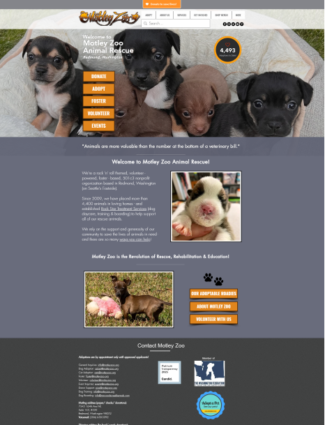
The Motley Zoo is an Animal Rescue with a brand centered around a pun about the rock band The Motley Crew and this influence is heavily reflected in its branding and website design. The goal of the site is to bring people into its community and have them engage with the organization through donation, adoption or fostering.
The Problem
Since the website is branded more as a rock band, and less as an animal rescue - it can be seen as less inviting to some users. This paired with the complicated bramble of navigation elements makes the site hard to use. Which brought me to the question: How might I make the site navigation more intuitive for animal lovers coming to this site looking to adopt, foster or donate?
Solution
A brand overhaul. My objective is rip up the old brand, and create a new site design that is bright, accessible and more intuitive for users. By doing this I will create a better experience for new comers, and a better way for the organization to understand how to accommodate its users in the future.
RESEARCH PHASE
Card Sorting
User Led Research
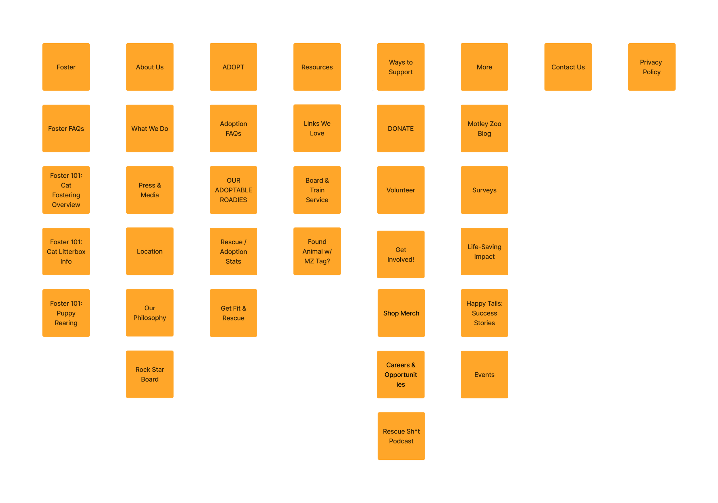
For this design I searched for a wide variety of users to test. I found many users with a wide range of interest in rescue sites. From avid users who spend a lot of time looking at these types of sites... ( like my wife ) to people who rarely interact with them. This way I can better plan how they will view the content. From there I gave them each cards with the page names on them and asked them to sort them into groups however they preferred. The most shocking result was that they were all very similar with minimal deviation.
Key Takeaways
- Most Users took the ‘Contact’ and ‘Location’ page and grouped them together - or combined them into one.
- My users also wanted to give each engagement item its own category. (e.g. Adopt, Foster, and Ways to Support)
- They also agreed to removing duplicate links that had no context around them.
RESEARCH PHASE
Identifying the Users
The users of this site are very wide ranging. Most people will be those who care for animals and are looking to either adopt or learn more about the organization. But there are some who are curious or want to show support to a new organization. By learning about these different types of users I was able to distill them down into a wide ranging Proto Persona that I used to define their general goals and pain points.
Michelle Morales
Age: 30
Tacoma, WA
Bachelors in Nursing
Registered Nurse
DEFINE PHASE
Proto Persona
This Proto Persona takes the main goals and motivations of the people using this site and creates a representation of the average user. This user is what I used to establish the criteria for success.
Goals & Motivations
Wants to get a dog from a rescue rather than a breeder.
Easily adopt an affordable, family friendly dog.
Wants to help a local non profit - potentially donate money.
Wants to learn more about the fostering process.
Pain Points
Not knowing enough information about pets and adoption.
Wants to know about the non-profit and make sure it is legitimate.
Pets should be sorted by types, cats and dogs, for easier viewing.
Response time from company - concern about contacting.
Navigation through website to find relevant topics
Problem Statement
The Process for helping the animals at this organization can be difficult to understand when animal lovers go to the site and get lost in the poor navigation.
I believe that redesigning the main navigation and updating the UI will help animal lovers discover how they can easily adopt, foster, or donate, with Motley Zoo..
“ How can I make the navigation more intuitive for Animal Lovers who are looking to help by adopting, donating, or volunteering? “
RESEARCH PHASE
Final Card Sorting
Final Card Sorting Results
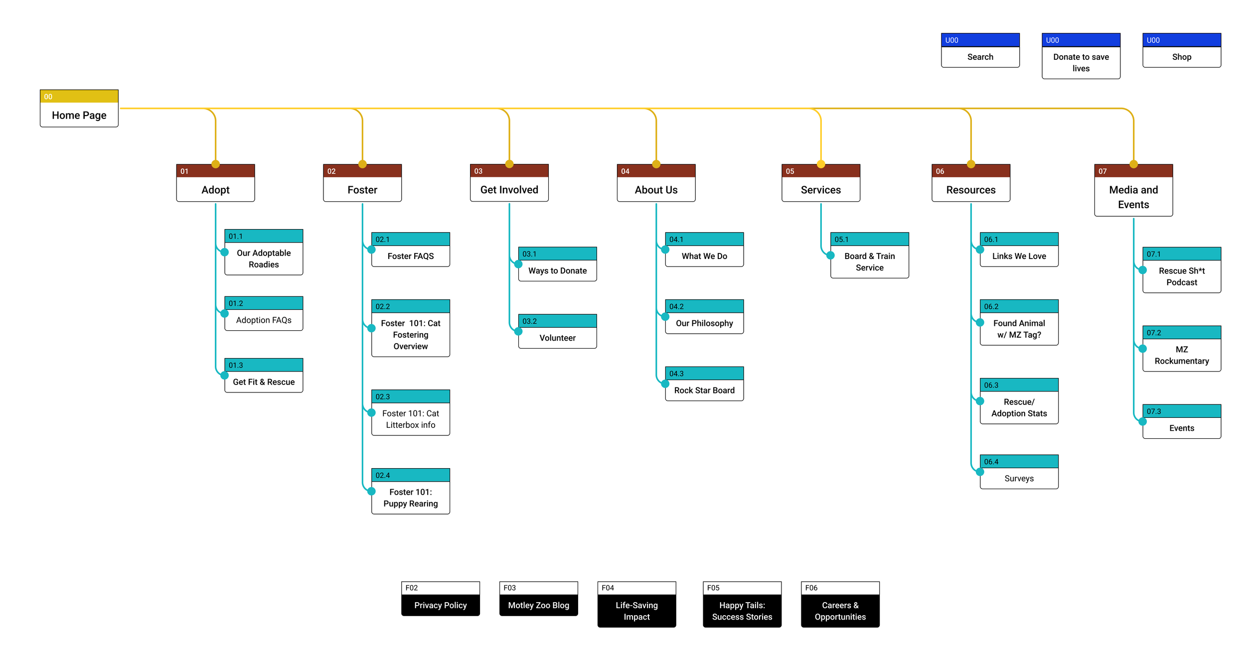
Using the Proto Persona to guide my choices as well as the user generated categories - I created a new organization of the pages on the site.
My focus was on creating clear paths for users to find the info they want on a given subject ( like adoption or fostering).
After those were defined I pulled out the other minor items that could be utilities on the site like the merch shop or privacy policy information.
Final Categories for Navigation
Planning around Priorities
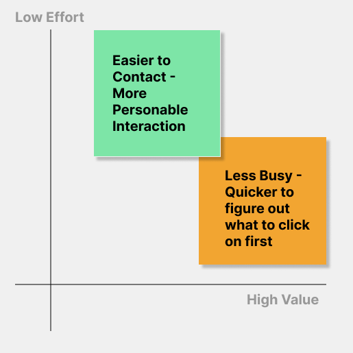
Using a 2x2 prioritization matrix, I made it clear that the top items that our users wish for is to make the site easier to use and more personable. How do we do that? First I aim to tackle the usability of the navigation and make the path clear for users to understand where to start. For this step I looked to add other navigation items to the home page in order to give people more context to their decisions (like adoption or fostering).
Next I want to make the brand more personable. The brand and design are dark and less inviting than most rescue organizations. In order to fit the style of the organization I planned a re-brand which will allow me to brighten up the page and make it feel more welcoming to new users.
DEFINE PHASE
User Journey Map
Understanding the User’s Movement
Opportunities to Change
- Remove the secondary navigation in the Hero section - create a separate section for navigation farther down that page that provides more context before users click it.
- Provide an Adopt section on the Home page for people to look through pets quicker without having to navigate to the third party site that hosts the additional info.
PROTOTYPE PHASE
Updated Site Map
Sketch Prototype
My prototyping always starts with some fairly detailed sketching in order to get a sense of the UI components and how they can align with the light and dark aspects of the brand I am working with. While this may add some time at the beginning of the project, it will help me to iterate on the branded content of the website.
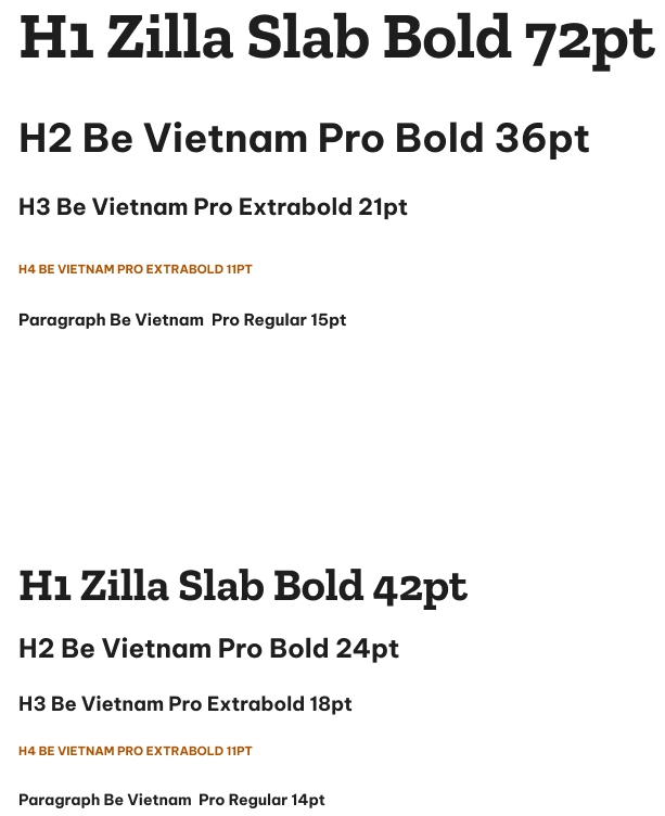
Brand Refresh
As I mentioned earlier, the branding of the site was dark and grungy to match the name "Motley Zoo". While the pun is fun and silly, the rest of the site did not match this energy. In order to make the site more friendly to new comers I decided to brighten the color scheme while retaining some of the brand colors. To start I created a new logo that is easier to read, and makes it clear what the organization does.
Primary Color: Orange #FF7700
Secondary Color: Burnt Orange #C15B01
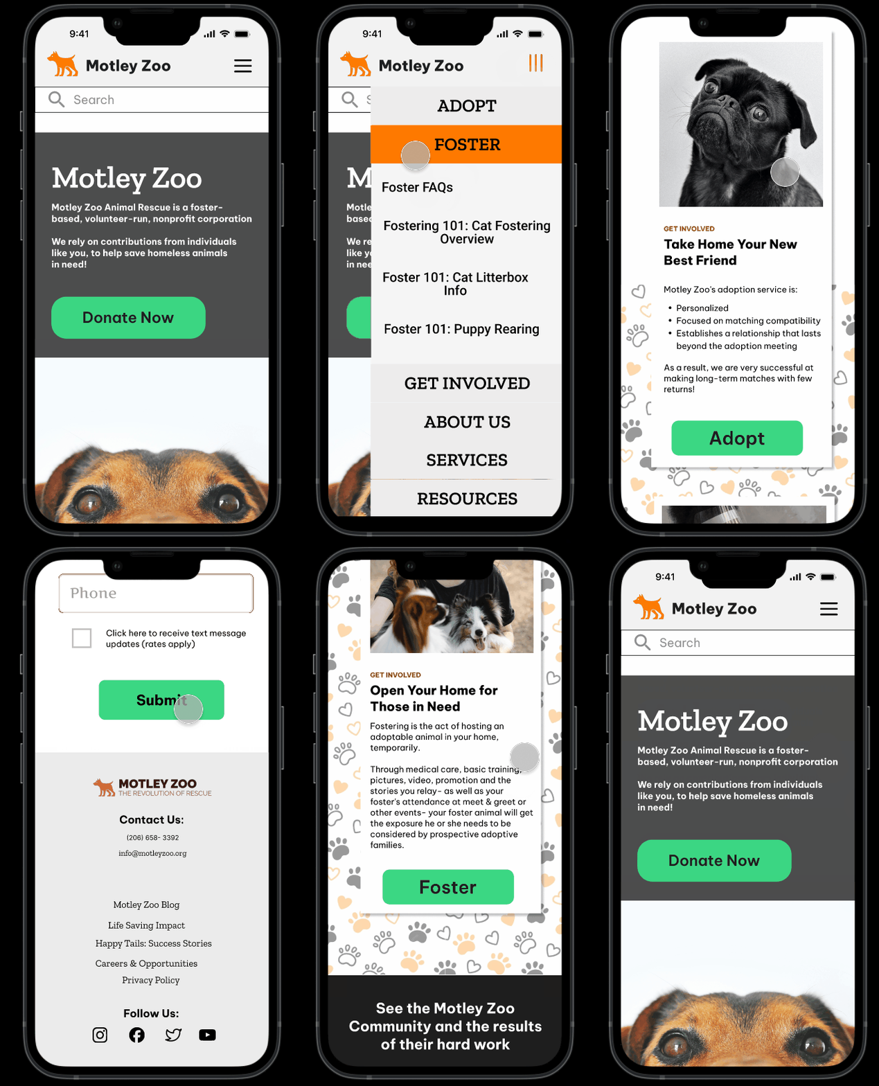
High Fidelity Mobile Prototype
With the site map and brand elements updated the prototype becomes easier to bring to life. The components’ styles are informed by the brand direction and create an easier flow for new users to figure out.


